Bc.zone is a modern podcast and media brand designed to spark curiosity and built around the power of voice, storytelling, and meaningful conversation. Offering podcast production, professional voice-over, and audio and video editing, the studio needed a distinctive visual identity that communicates creative energy and technical expertise.
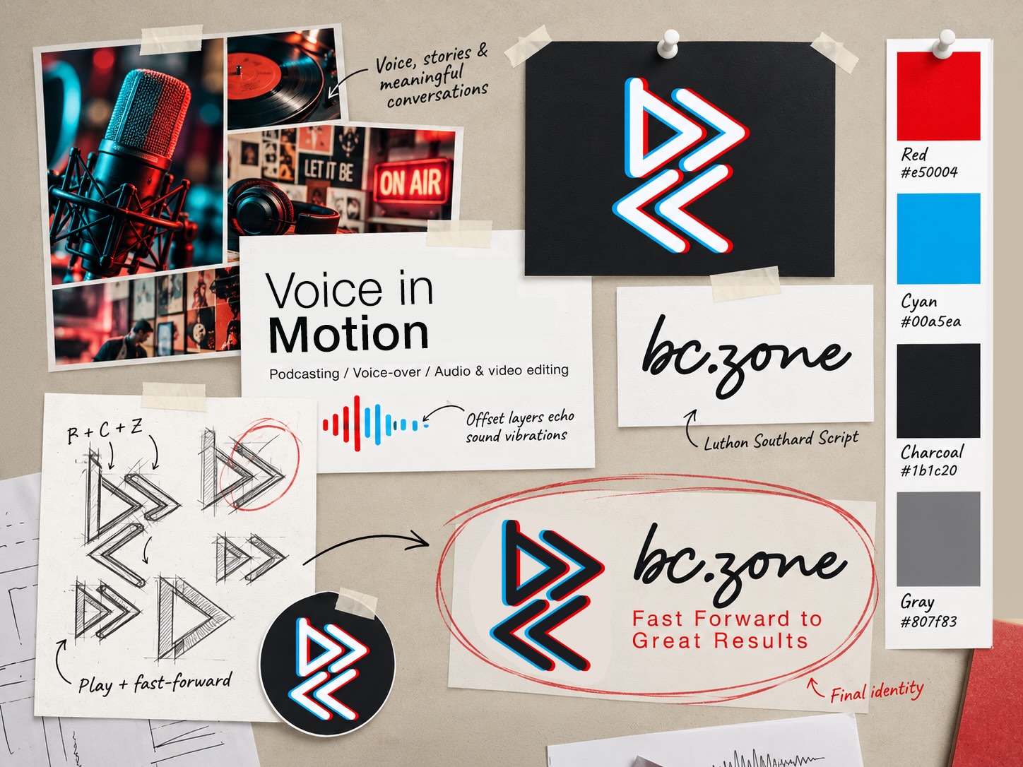
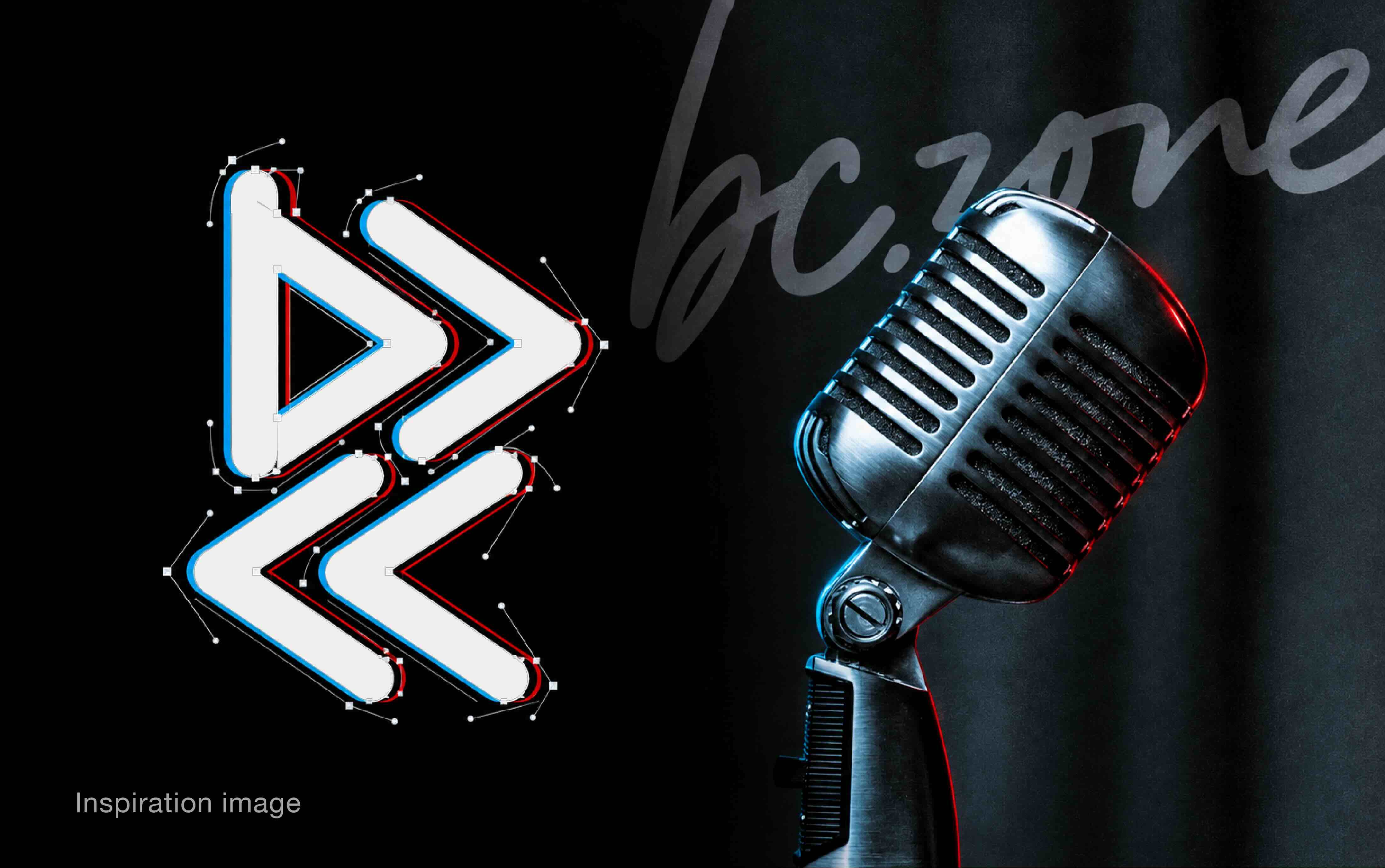
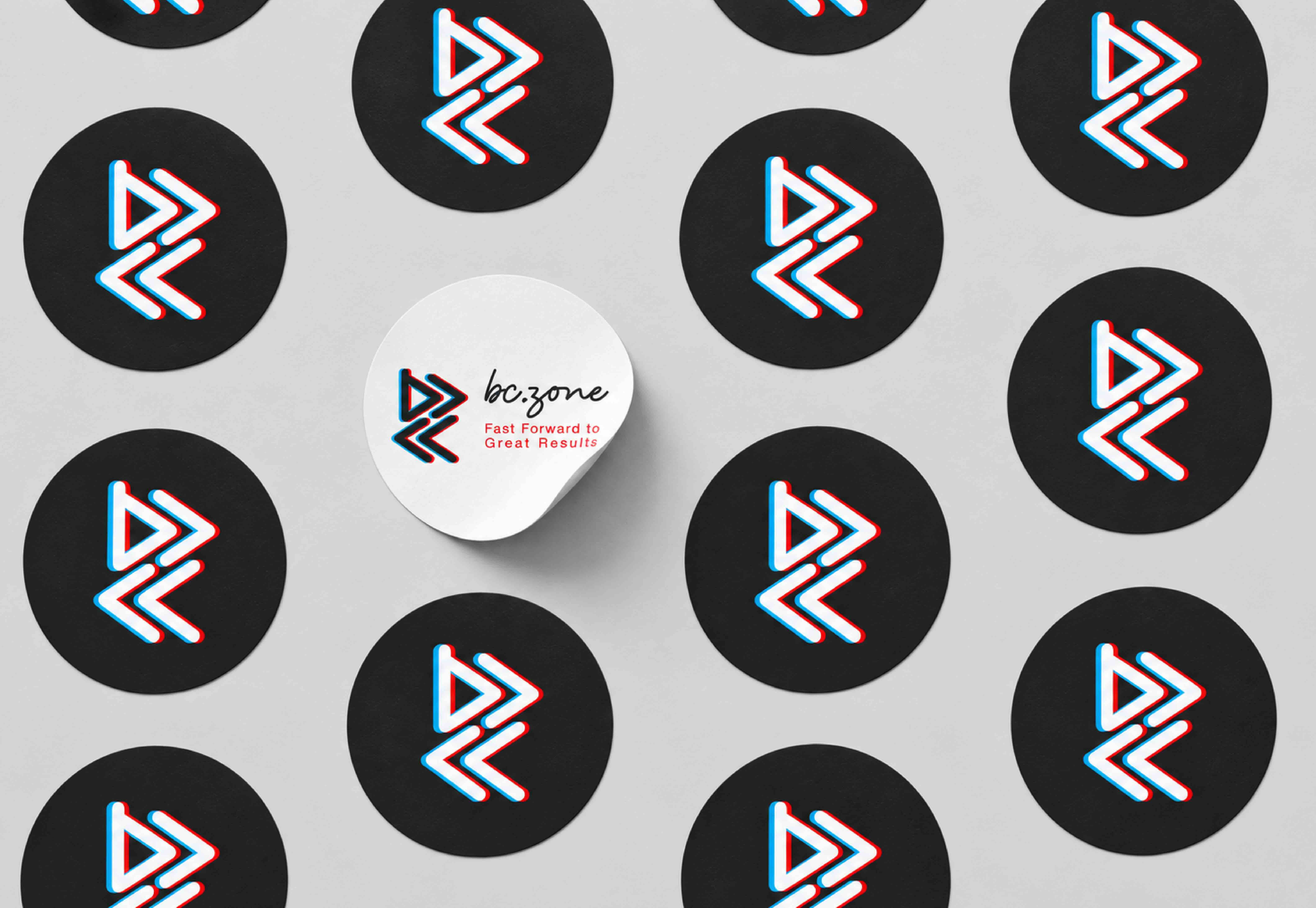
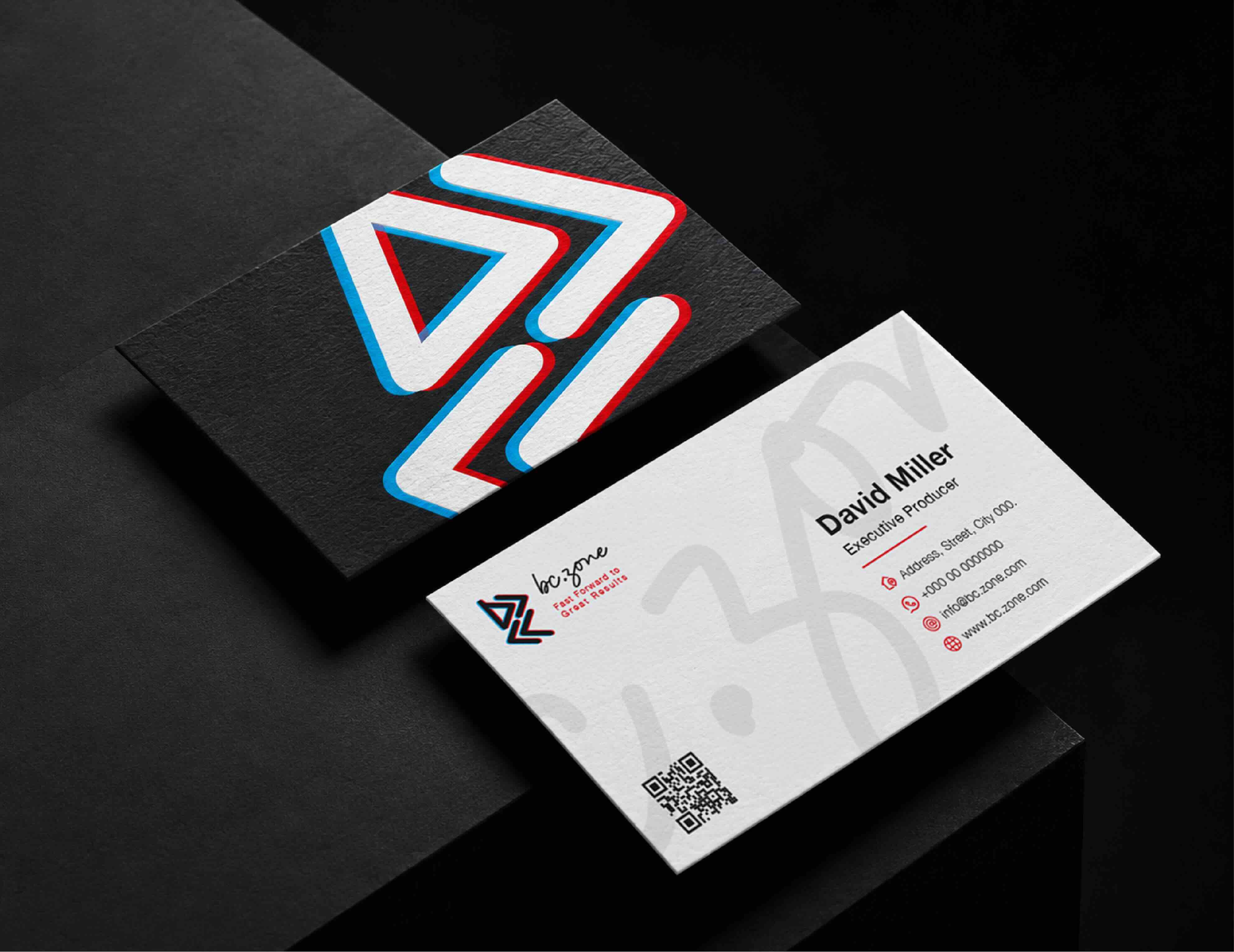
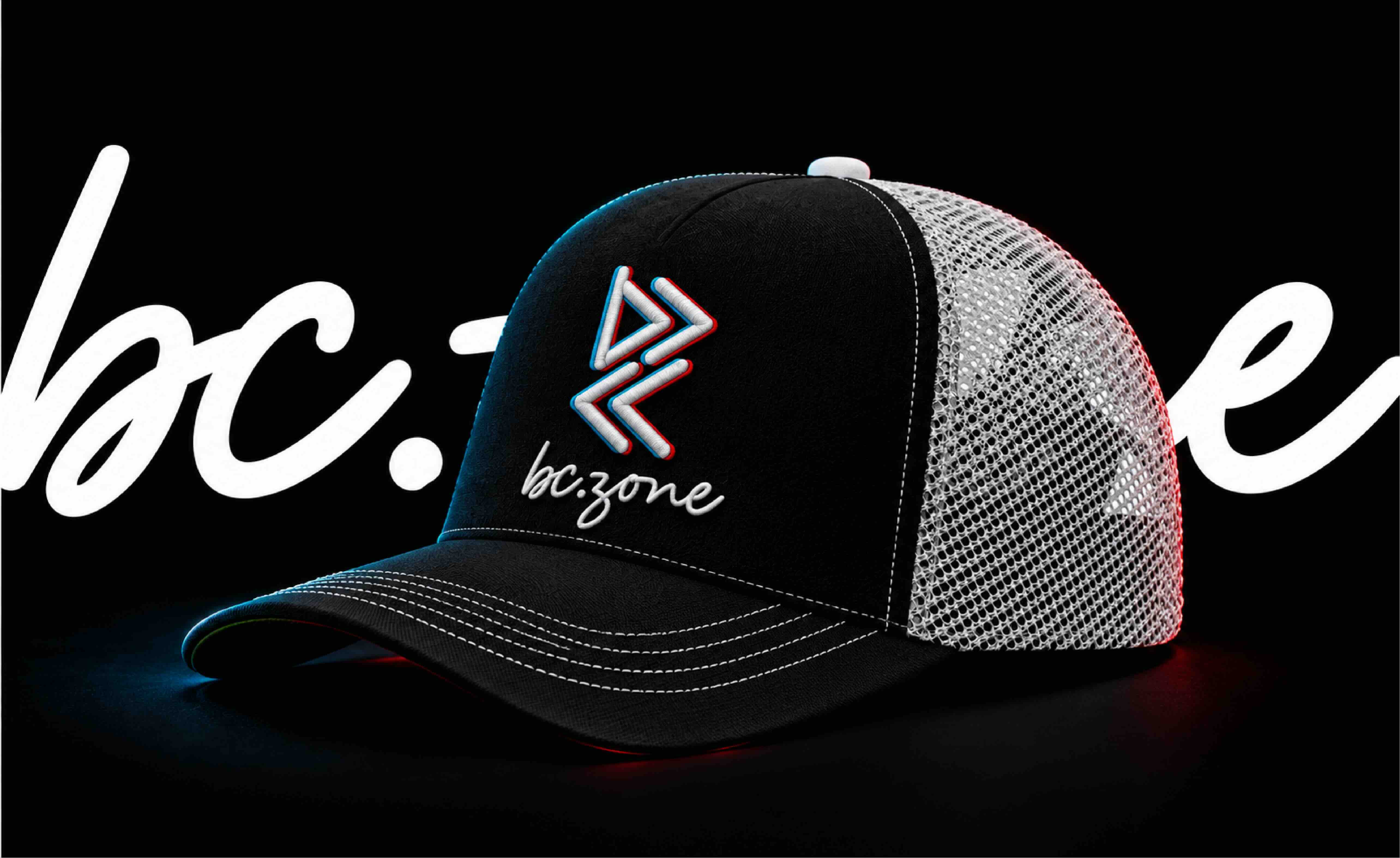
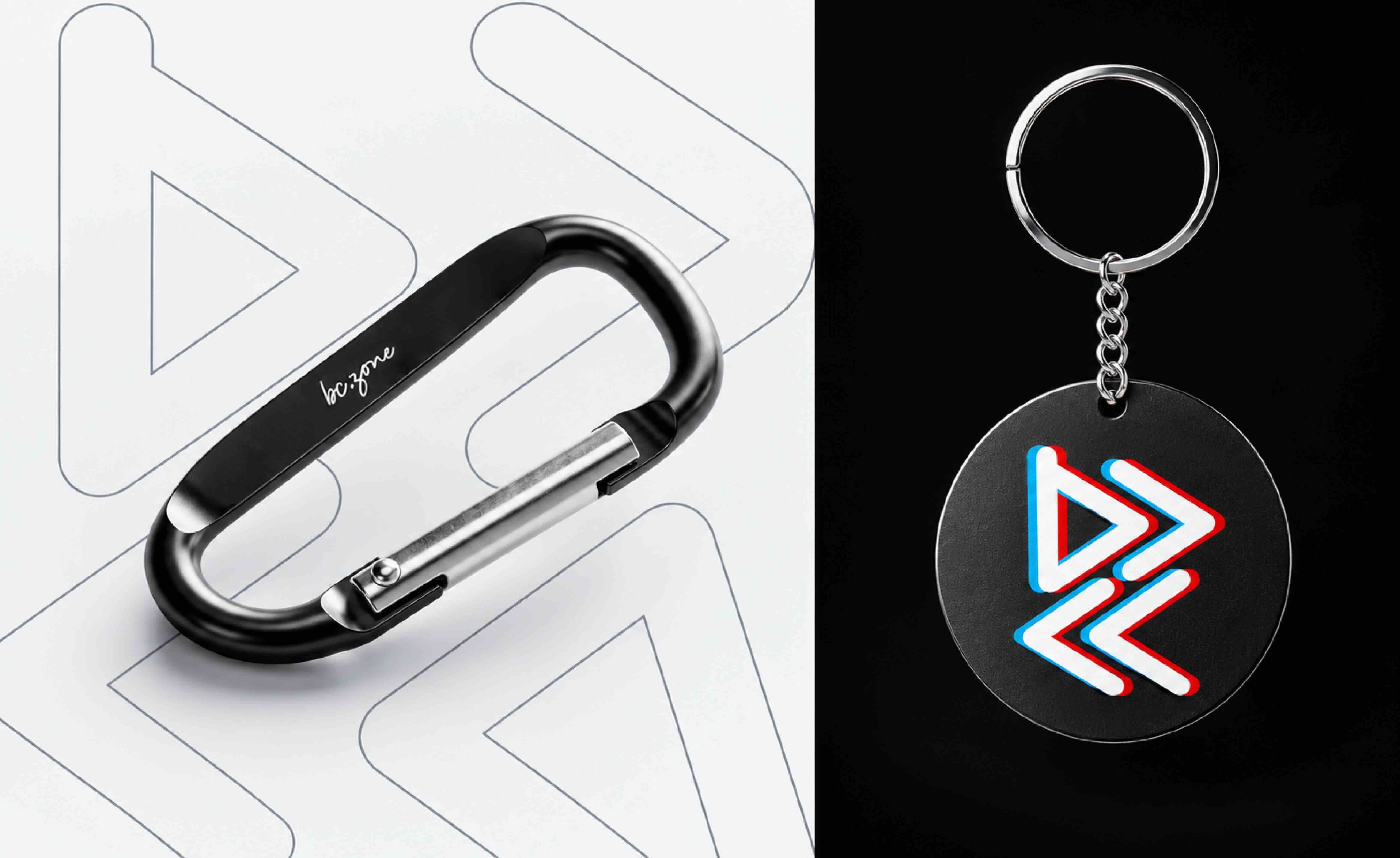
The emblem combines the letters B, C, and Z with play and fast-forward symbols, connecting the brand’s name to its purpose: bringing stories to life and moving ideas forward. Offset red and cyan layers echo sound vibrations, creating depth, movement, and a vivid three-dimensional effect. This visual rhythm reinforces the brand’s promise: “Fast Forward to Great Results.”
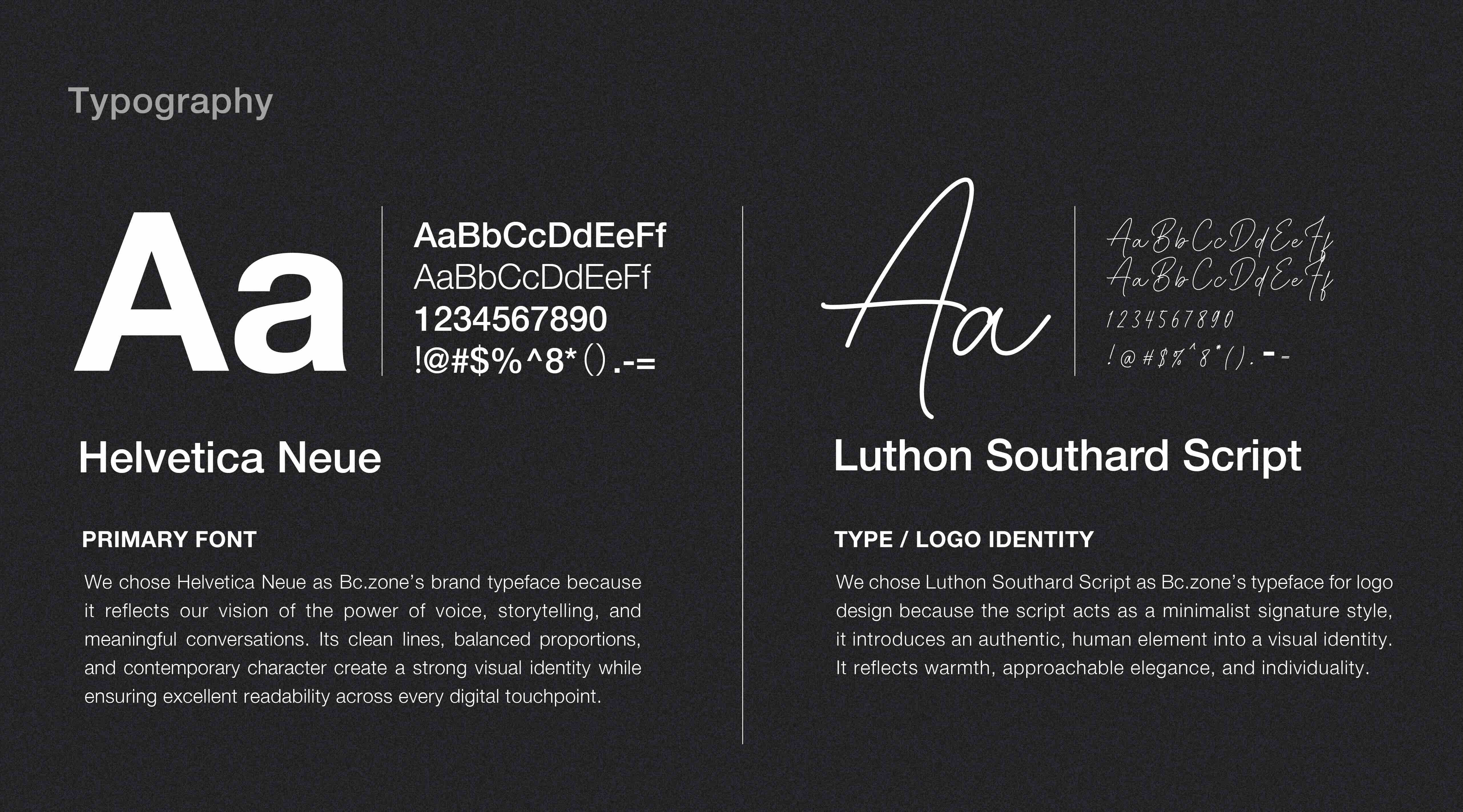
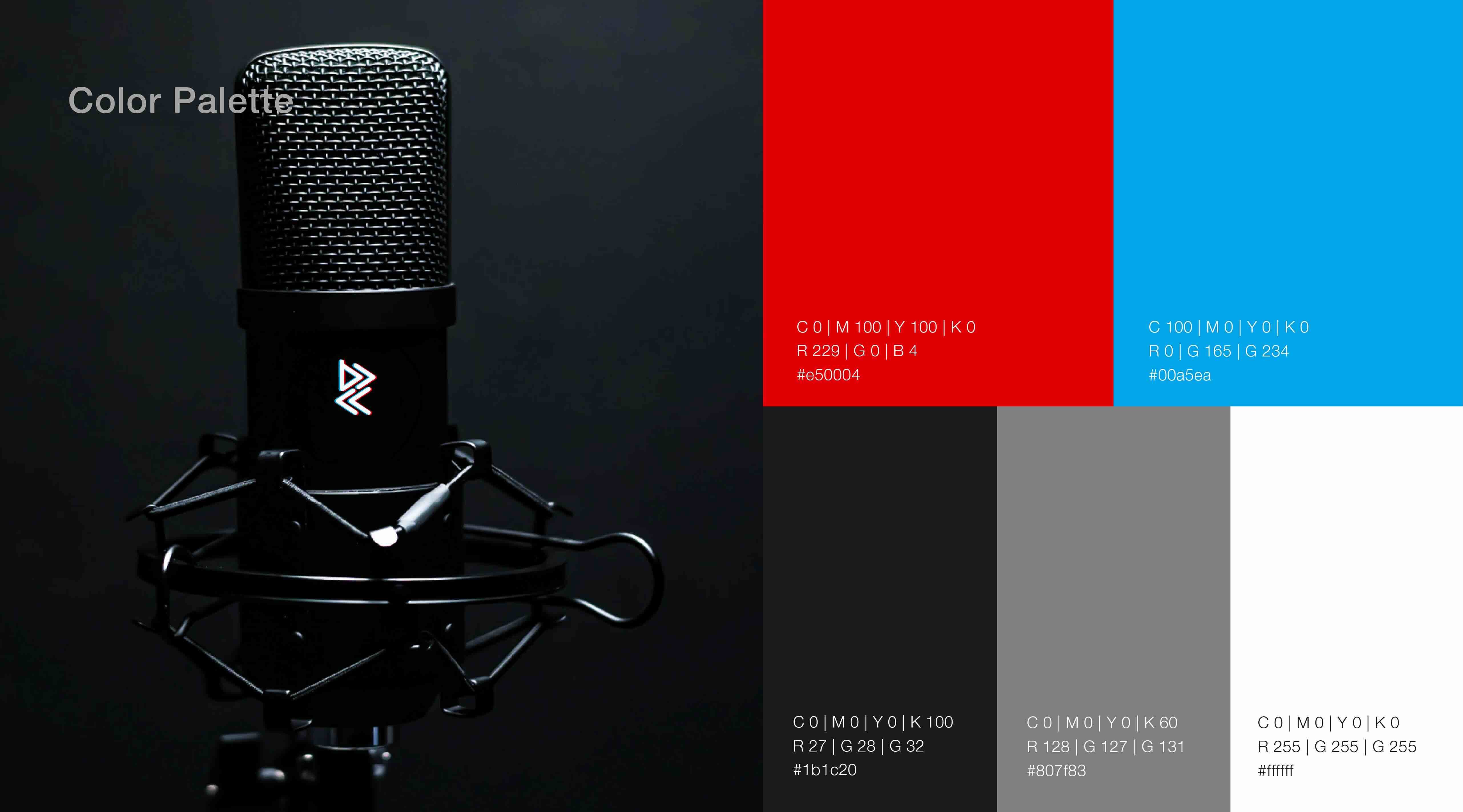
Grounded in black, the palette balances vivid colors with a confident, professional presence. Red, cyan, white and gray provide contrast and breathing room, allowing the identity to adapt across light and dark backgrounds. An expressive script wordmark brings a personal, conversational quality, while clean supporting typography keeps information clear and accessible.
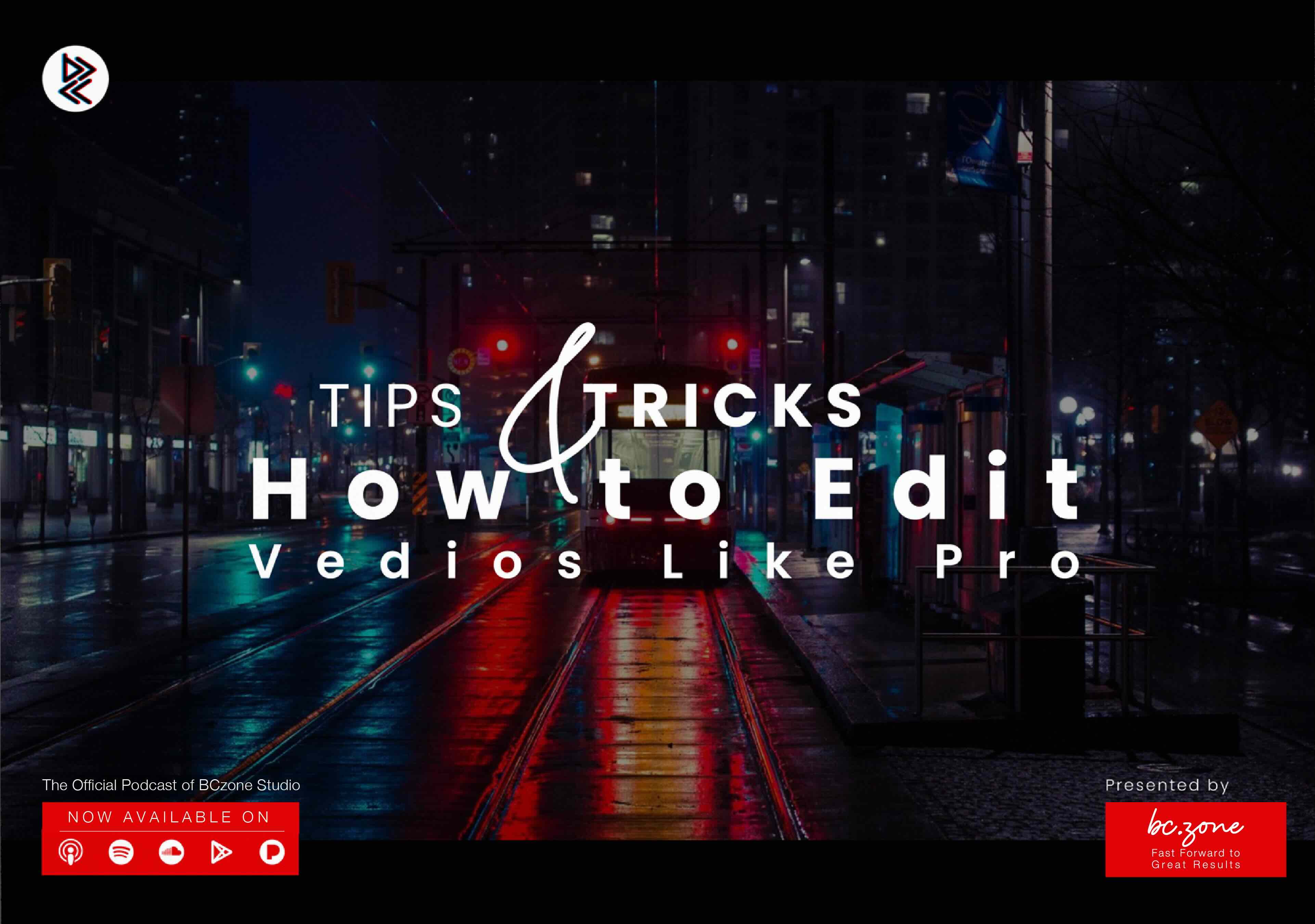
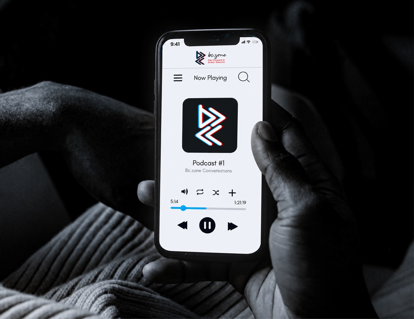
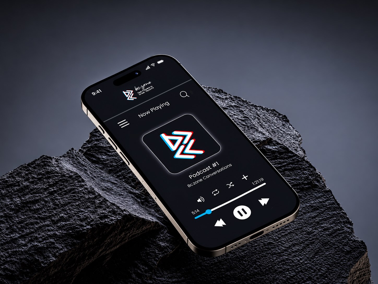
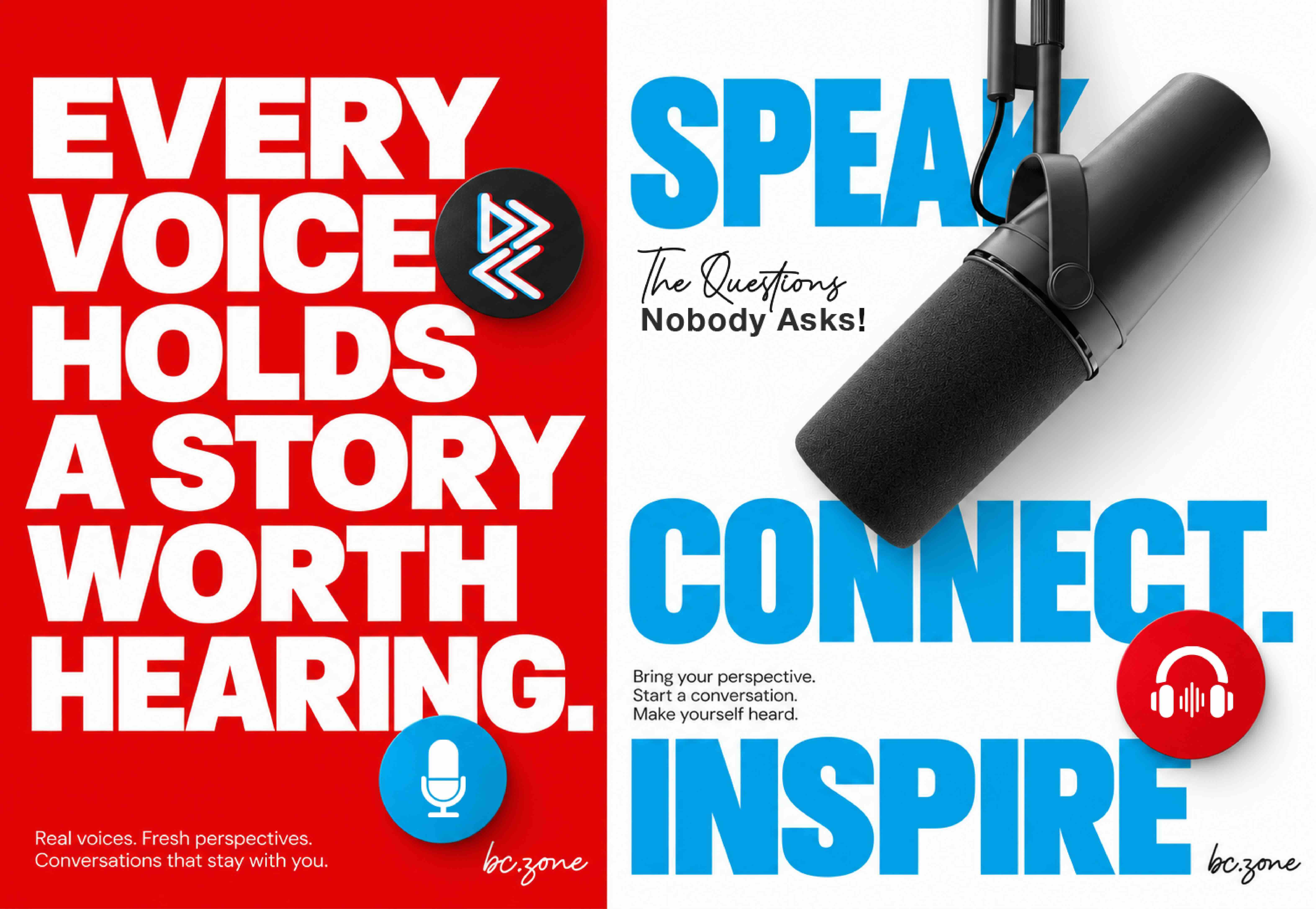
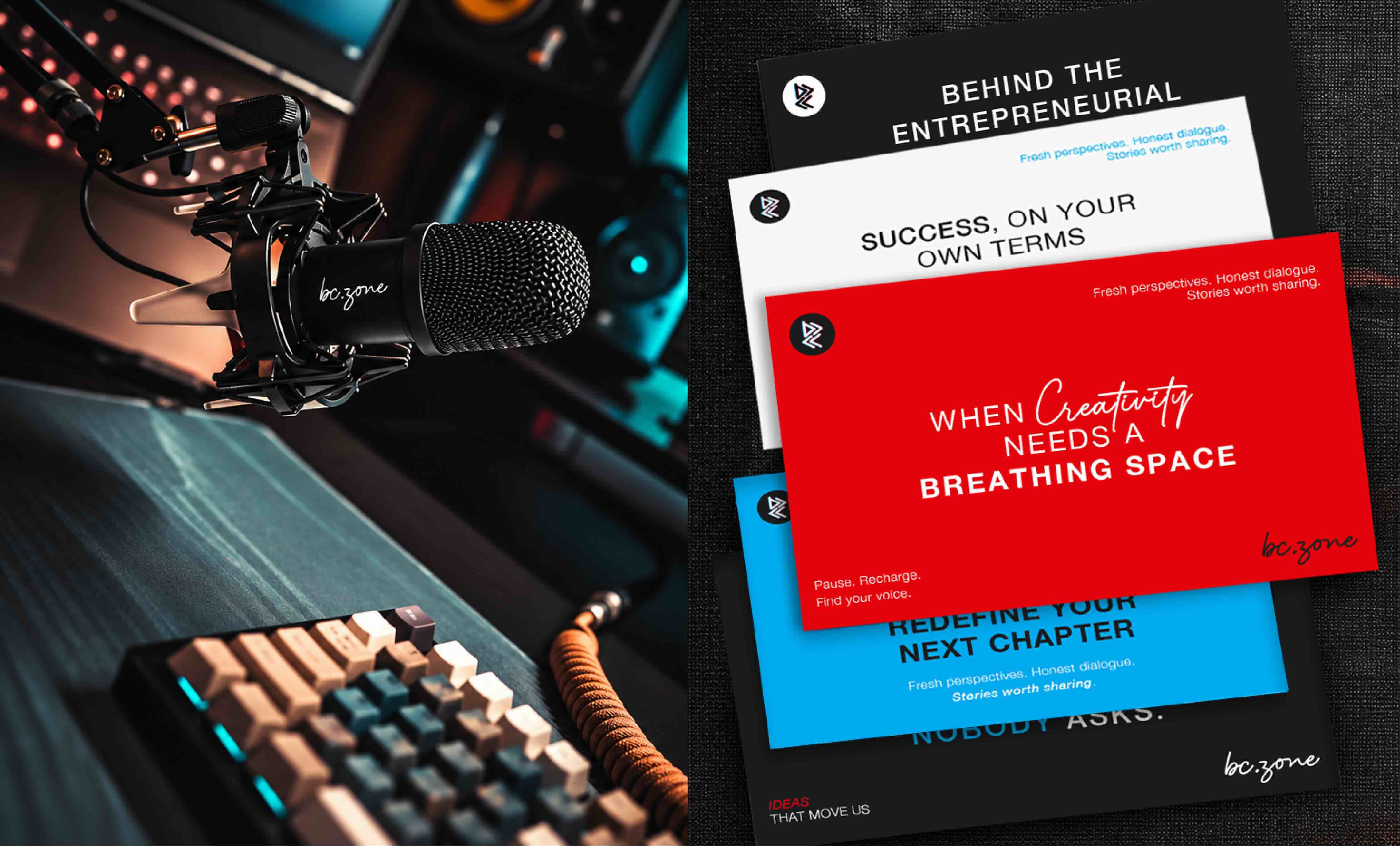
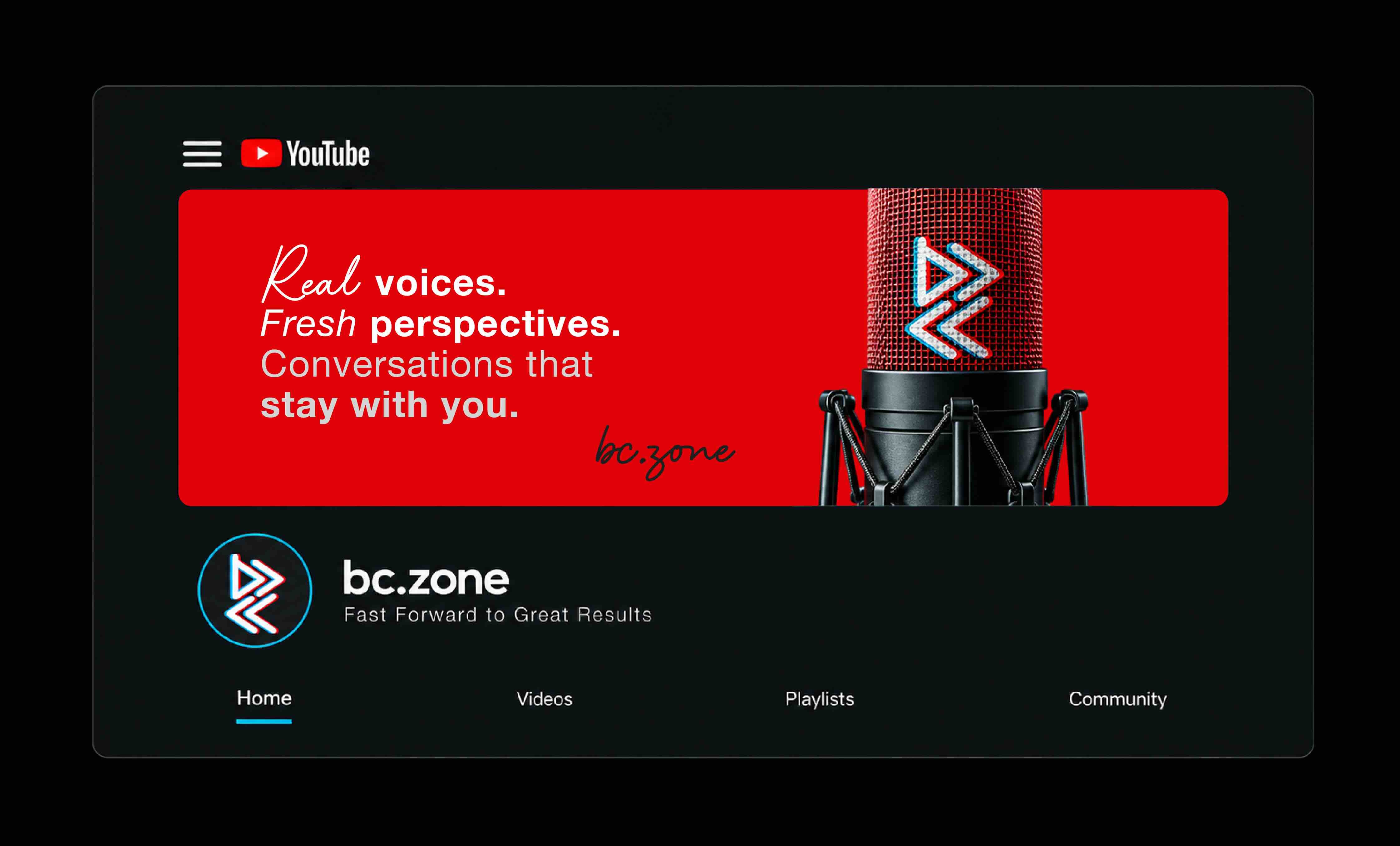
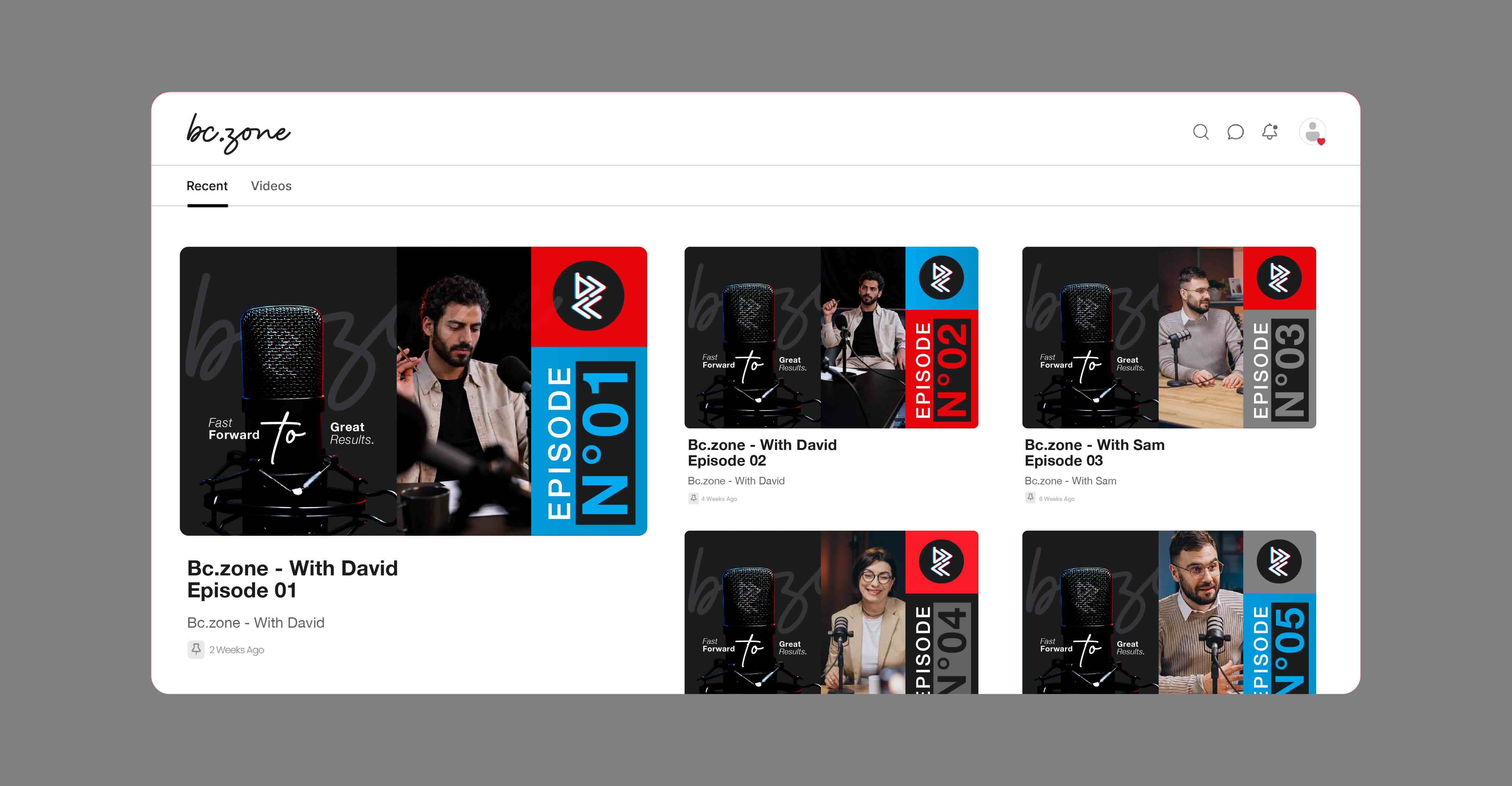
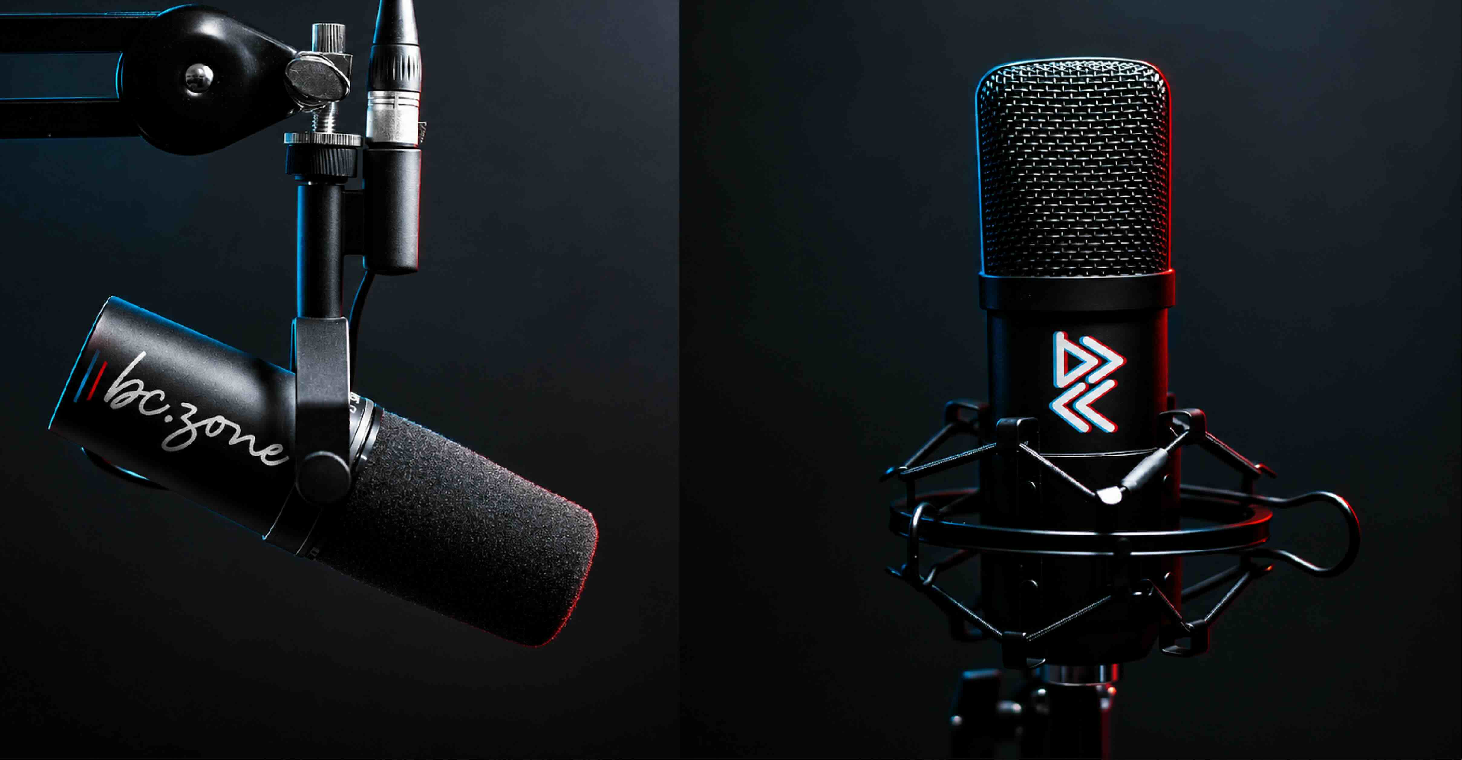
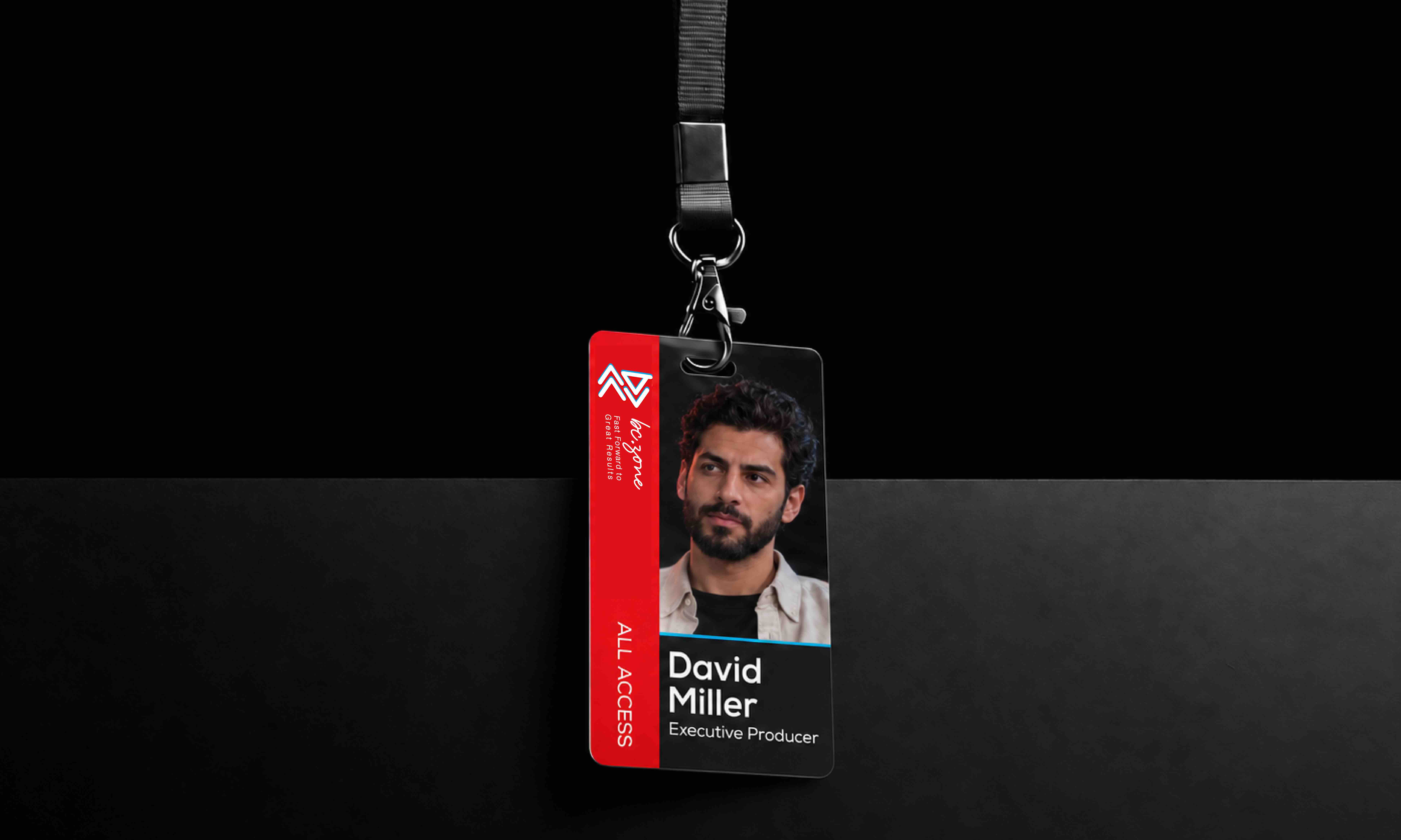
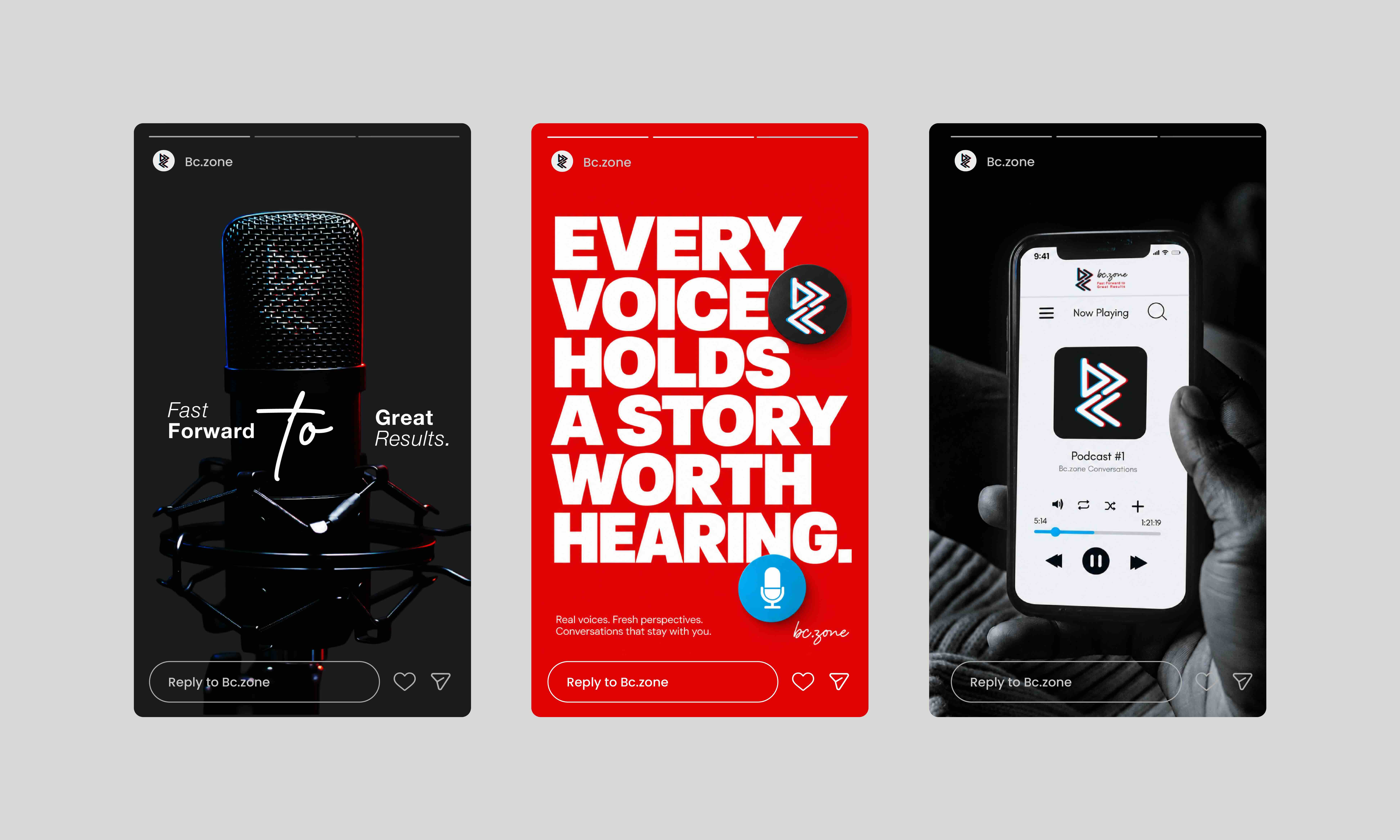
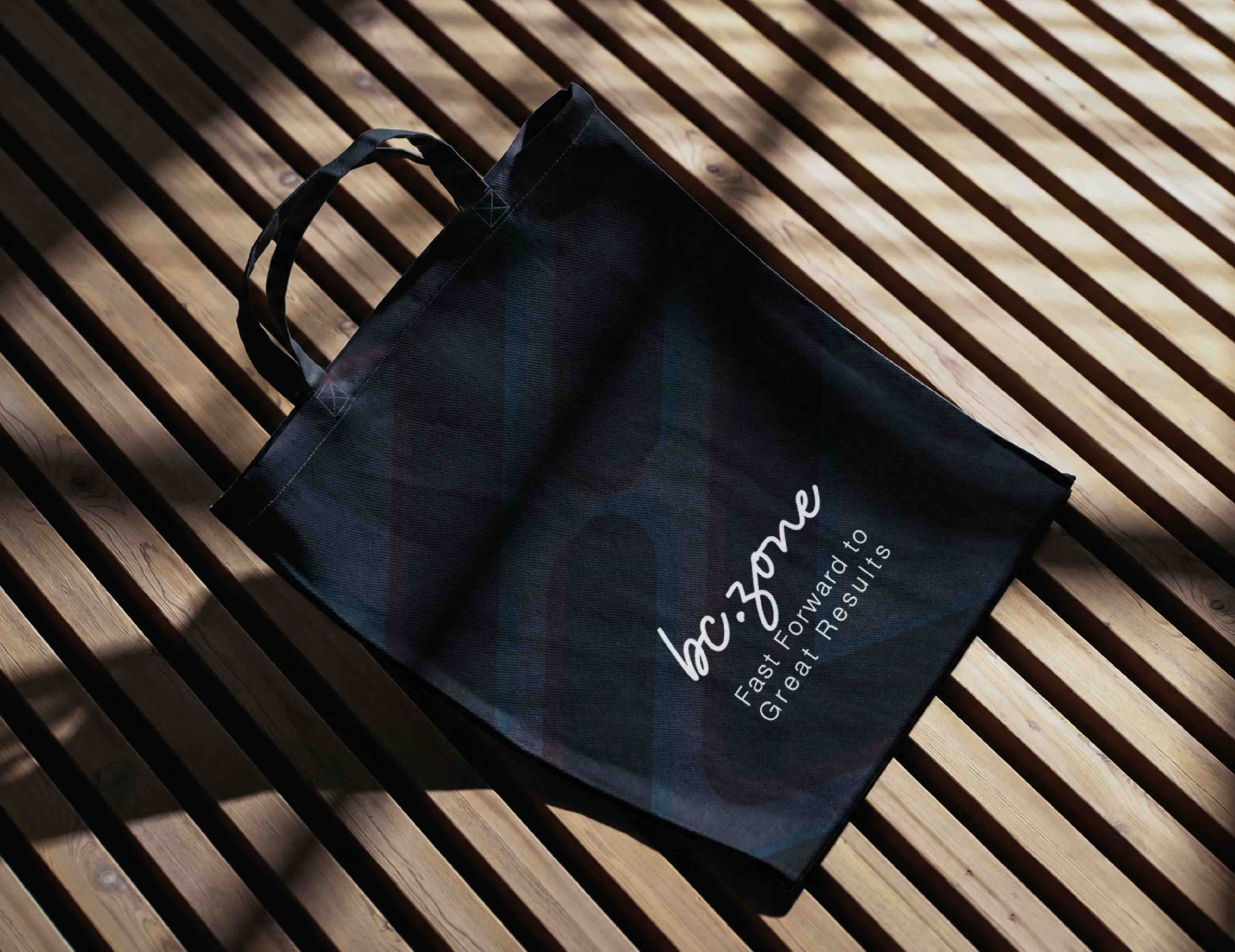
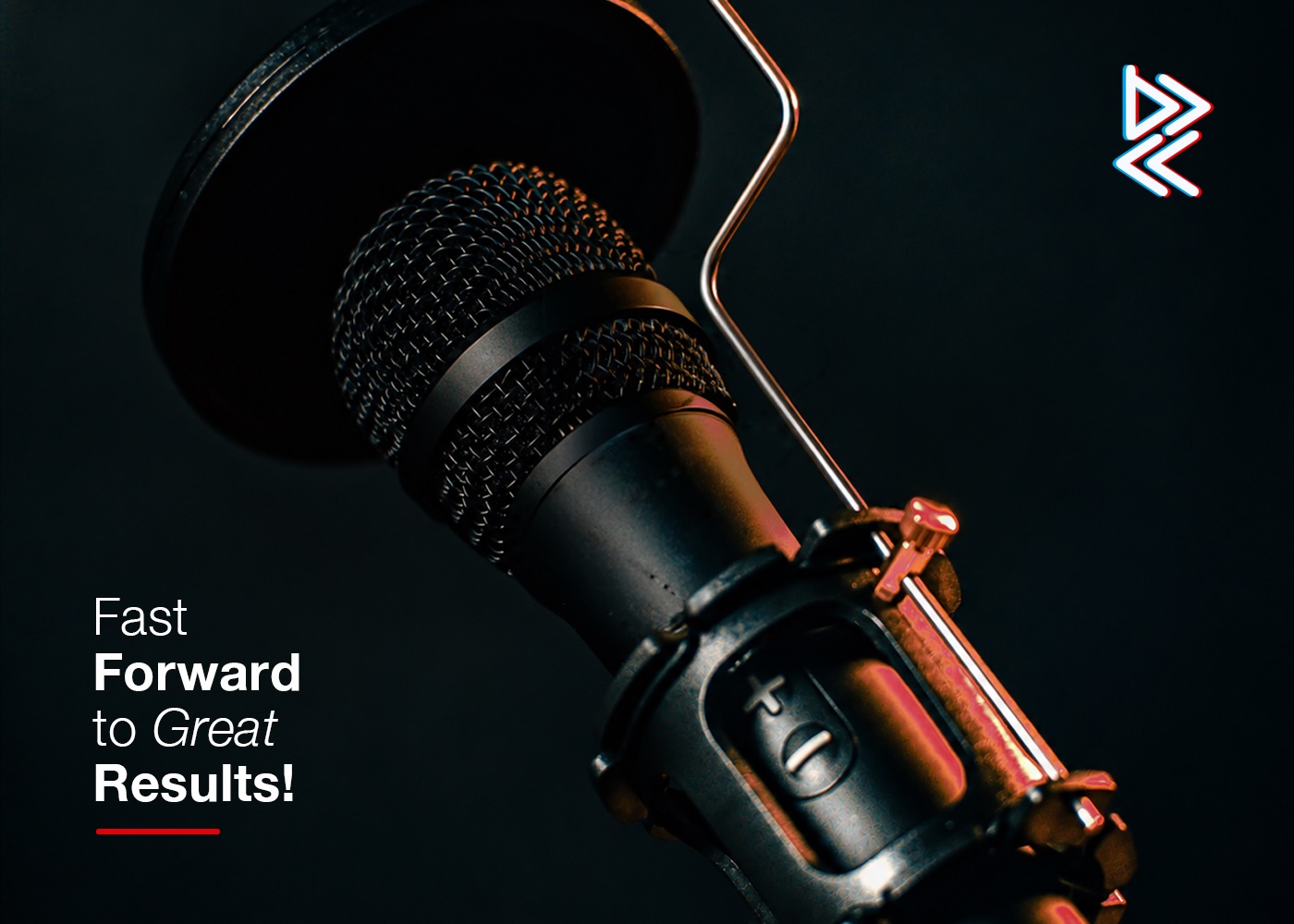
The visual system extends across podcast platforms, social media, websites, studio equipment, stationery, and branded merchandise. Flexible logo arrangements and a standalone emblem create a consistent presence, from small profile icons to prominent studio applications.
From concept development and logo construction to typography, color strategy, and realistic mockups, the project brings every touchpoint into one cohesive identity, giving Bc.zone a recognizable presence that reflects both the craft behind production and the human connection at the heart of every story.